Monday, April 12, 2010

Storybook design process part 2

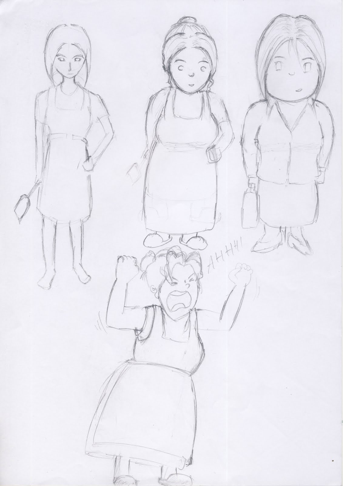
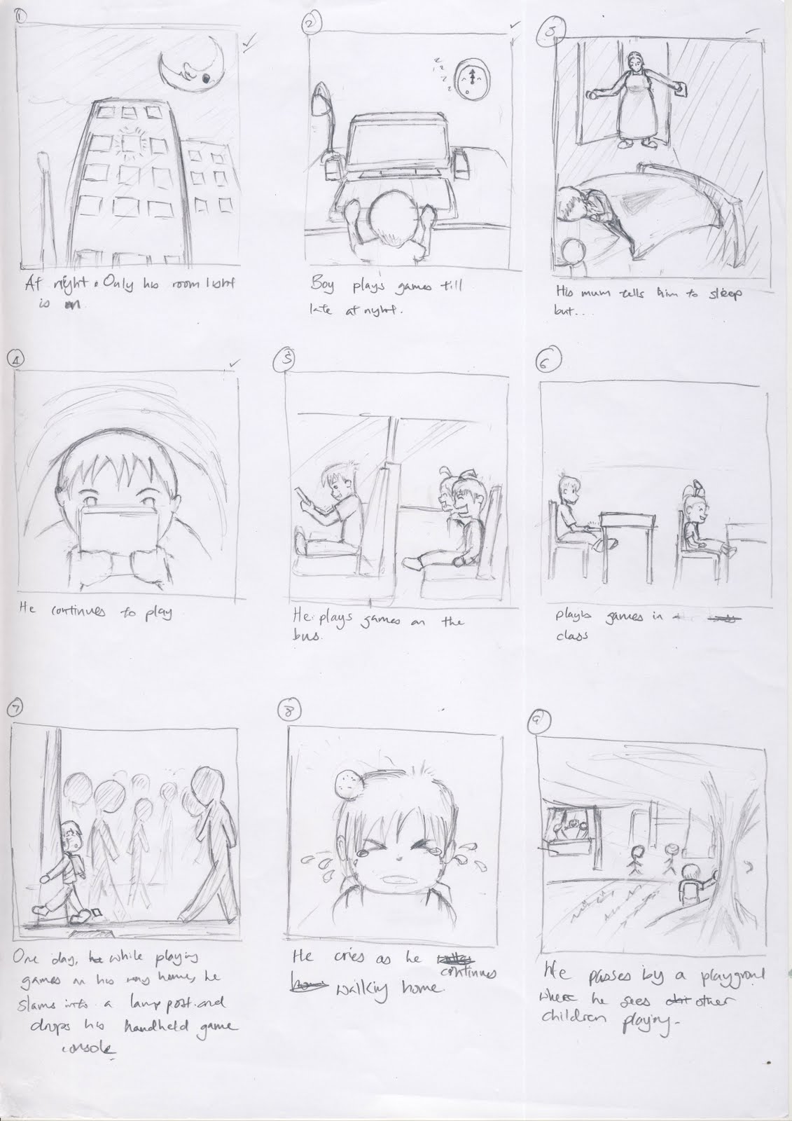
This is the grid layout that we apply to each page. The did not want to place the text on the image itself as we thought be more difficult for the kids to read the texts.

Printing process
Our initial decision was to produce a hardcover copy of the book. A hard cover version would give our book a classic feel to it, similar to the Walt Disney fairy tale books such as Beauty and the Beast or Cinderella. However, we opted for the soft cover version of the book due to time constraints. Producing a hard cover book requires at least one week while a soft cover book required at least 3 days.
Fortunately, I managed to find a printer service who could print and bind the book in 30 minutes! The shop is called Leadership Centre at Peace Center, near Doby Ghaut MRT.

The printing was done on Saturday. 2 days before the presentation date.

On the day of the printing, I was given a variety of papers to choose from. There were glossy papers, cast coated, matte, machine coated, each of which were of varying thickness and feel. At the end of it, I opted for the story to be printed on matte coated paper and the glossy coated paper for the cover page. This would help differentiate the cover page from the rest of the pages.

The book is printed on both sides, bounded by stapling at the center.

POssible characters thumbnails


Sketchs on the possible settings: bedroom and pavement


Playground and on the bus

character: mum


Character: Timonthy (protagonist)


Storybook storyboard


This is the storyboard sketch of the book. The story is broken up into frames. The first few frames creates the setting and addresses the problem. At the 7th frame, we introduce the 'complication' which will allow him to realize his problem later. Next we show him thinking about it and his actions to change his attitude.


Storybook design process (storyline)


Storyline

The story is about a boy who got addicted to playing games at a tender age of 7 -9 years old and how he deals with it thereafter.


The message that we wish to send across is that gaming can become an obsession if left unchecked. This is very relevant in our society today as we see kids playing their hand held game console at every place i.e. in the MRT, on the bus, in school, while walking home etc.


Final Design for the storybook


Infographic development


This is my initial design. The guy at the center is suppose to represent mankind. The whole purpose of this design is to show that we as humans have to choose which route to take. The consequences on the left are those of more death and disasters such as droughts, floods etc. On the other hand, we can choose to take actions by collaborating with one another to better manage resources, control existing usage or provide greater incentive to use alternative energies.

However I decided to scrap the idea altogether mainly because the presentation of this image makes it such that there are only 2 routes to take, which may not necessary be the case.

Infographic - Fighting Climate Change


Firstly, I have to say doing this infographic is really a challenge. Considering I have no colour sense, finding the right colour to use had become so much of a chore, it was very frustrating.
OK, moving on from my rants. The article i chose is authored by the United Nations Environment Programme in 2007.
In this infographic, I wanted to provide awareness on the more important indicators of climate changing. And since our target audience are the subscribers of such genres of magazines, I think it would be better if i leave out most of the technical details.
I wanted to show degree of worsening or improvement of each indicator. Hence, the use of the thermometer. The 'glow' of yellow and red indicators the importance level of the indicator.
I positioned the Earth close to the fire to tell the viewer that global warming does exist and it is a very serious matter that we should be concern about.
Lines are drawn from various positons on the Eart to lead the reader to the body of text which are placed close to them. Closer proximity between each text and its corresponding lines is ensured to indicate their relationship.

Saturday, April 10, 2010

Principles of Art and Design

In the lecture, the lecturer mentioned about symmetric and asymmetric designs. I think that symmetric designs are you pretty easy to produce. Such pictures usually appear to be of equal 'weight', balancing on the central fulcrum. Symmetry can also be taught of as a balanced or gradual movement away from the center point. Take for example flowers. Their petals unhold in a circular manner from the center.
Asymmetry is, on the other hand, harder to pull off as we have to consider that the 'weight' of our objects in the picture vary in sizes, shapes etc, thus making the balancing act some what more delicate. This reminds me of those physics based balancing games where you are given boxes of varying sizes and weights and your task is to balance them across some plateform.

Assignment 04 Colours and Coalition

These are the thumbnails for assignment 4. The theme for this year is "torch of friendship". The torch signifies among other things, determination, inner desire to do ones best and improve oneself. I think the ones have the black background really does make the flame stand out even more.


The elements of Art and Design

Colours. I've always thought of them as just something to give an image some vibrance. After going for this lecture, I now think that you can probably tell a different story using the same image but different colour combinations. I think it's just how our minds perceive these colours. i.e. red conveys strong emotions as it come across as being very attention grabbing.
blue on the other hand, does not have the same effect.
Furthermore, it's not just the meaning of the colour itself that is important, but rather the context in which you use it that sends the nonverbal message.

Monday, February 22, 2010

NM2208 assignment 02.


This is the abstraction process and final piece for my assignment 02. It serves as a directional sign to tell people where the dojo is. Everytime you cut down on a certain detail, one must ask if the omission would sent a clearer, more direct message to the viewer. One of the suggestions to further cut down on detail is to erase the bottom half, slightly below the waist and expand the top half, since the most significant parts of the sign are the head gear and the shinai.


Tuesday, February 9, 2010

NM2208 reflection - week 05 lecture

From past, experience, adhering to the rules of thirds in filming is essential to the asethetics of the film. I'm not sure if it does apply just as much to photographs, but from the lecture, it seems so.

I think, to tell a good photo story, one must consider the camera shots to use to tell the story. I.e. you can use mid range shot to introduction the scene to the viewers. Medium close up shot can be used to introduce your characters. Since we're dealing with photos, it may not be appropriate to have too many elements in one photo. This might confuse the viewer; he might not know which one to focus on. Conculsions are done to leave an impression on the viewer. Maybe you can have wide shots to end your story.

nm2208 reflection - week 04 lecture

I think the most important part about the abstraction process is that we have to ensure that the most clinching characteristic that makes it identifiable quickly remains in the pictogram.

Also, I think that a pictogram may mean different things when used in a different context. I.e. a pictogram of a person cycling placed by a pathway may mean that the pathway is meant for cyclists to use. On the other hand, the same pictogram may mean "beware of cyclists passingby" if placed by a zebra crossing. So, question of "to whom" it is for is also important here.

Since there are also plenty of ways to represent an idea, I think it'll be useful to know which prototype best describes the idea in a way that is most intuitive for the viewers.

NM2208 Assignment 01 - Me myself and I


This is the final prototype that I've decided to use for the first assignment. I changed the design entirely to give more focus on the person (me) than the burger. Erm.. if you can't make out what exactly I drew, it's actually a person in the air. He, or rather, I drew myself with a fork ( Letter "U" ) on my left hand and a butter knife on the right, pouncing onto a burger. The camera angle looks at the scene from a top down angle.

One of the suggestions given by my peers is that I can try exaggerating the jump by placing a sky background or a skyscape background. This is really make it look like I would go that "far" to get a burger.

Wednesday, January 27, 2010

critique

The picture is a mini cooper advertisement taken from www.gushmagazine.com. The poster which was cut out into the shape of a mini cooper was placed at the top of the entrance of a subway station. The image was captured with people exiting or entering the subway station. With one side of its doors open, it gives the illuion that the car can fit many people at a time. I like the part where they contrast this idea with its small physical appearance. The word "SIZE" printed on the side door might have helped me direct my attention to this contrast.

Monday, January 25, 2010

Reflection item for lecture 03

For this lecture, I think the most important thing to take home is that we have to decide early on the resolution and size of the image before we start working on it. It would be disasterous to find out otherwise. I certainly don't want to redo my projects no matter how interesting they may be.

Burgers will be the theme for my first project.


This is the combined picture from the previous two sketches on procrastination. I thought of working on this initally but decided against it because it still did not quite represent the idea of procrastination. One could interpret this as me going to take a break from mugging. I did some research on the same theme and found the following picture to best describe a procrastinator. What I like about this picture is that the message is spelled out clearly even with the purposeful omission of the last few letters. ( one could still make out what that word is ) It makes me, as the viewer, think that he could have easily finished writing it but decided to put it aside for another day to do, which is what a procrastinator does!


4 rough sketches to Me, Myself and I

These are the 4 sketches I drew up for the first project. The first one ( top extreme left ) was inspired by past experience as a kendo-ka. Kendo means "the way of the sword."
I chose to sketch this because kendo is a very mentally and physically taxing sport and though I left it 2 years ago, the experience had burnt into my memory banks pernamently.
Second one is about my love for swimming. The swimming pool is fashioned into the letter 'g' with the deck chairs positioned to form the letter 'z'; together they form my initals 'gz'. I saw one of the works presented during lecture which had the name written to fit the back of an mp3 player. I thought it didn't quite utilize the form to express the designer's love for music. Perhaps using musical notes to form the name would better show the designer's love for music. This sketch was my attempt to do just that. Hahahaha... but one can also interpret in another way; that I like to hang out at the pool. Hahhahaa
Alright moving on, the next one to the right resembles that of a burger. This burger represents my love for Carls Jr burgers. My intials are written downwards.
The bottom two pictures represent one of my bad habits - procrastination. The table lamp represents the letter 'G' and the book marks represent the letter 'Z'. However, I think that the picture does not really say I'm a procrastinator. Another interpretation can be that I love to sleep given that there's a guy sleeping on the desk.

This is a rough sketch of what I drew during the first lecture. It is a machine that gathers the relevant information instructed by the user, filters them before sending it back to the user. Since designing anything requires prior research into the topic, i think it's best if we can have as much information as possible for us to immerse ourselves into, before digesting it and finally, creating our design.

Monday, January 18, 2010

Lecture 2 Reflection

Creating a piece of art versus designing a product. To an artist, a piece of art is something which he creates withint he boundaries which he sets for himself. This can originate from his life experience, his perspective of things, etc. But to the viewer, he does not have to look at it the same way the artist does. No matter if you appreciate it or dislike it, it is not a question of right or wrong. There is no standard of measurement for a piece of art. A design on the other hand has to adhere to a set of rules; a framework of steps to take and requirements to be met. This framework is called the design process. The idea is first conceptualized in abstract terms before actualizing it through its various forms. I think this is the part where we can inject our creative juices. Since our idea is abstract, there can be multiple representations of it. I think we just need to reflect back on our idea consistently throughout the process so as not to side track.

That being said, it does not mean that designers cannot be artist at the same time. Take for example, the Esplanade has been the subject of scrutiny since its design was made known to the public. Some say it looks like two halves of a durian, others say it looks like a pair of eyes of a housefly. The Marina bay Sands casino is said to resemble three joss sticks. Yet such works of art are feasible to build! Therefore a designer can also be an artist... you just need to know when to be either one.

Monday, January 11, 2010

Introduction

Hi,

I'm Guozheng, a 3rd year student in NUS. This blog is started to facilitate the writing of my reflections on the content covered during my weekly NM2208 lectures.