Monday, April 12, 2010

Storybook design process (storyline)


Storyline

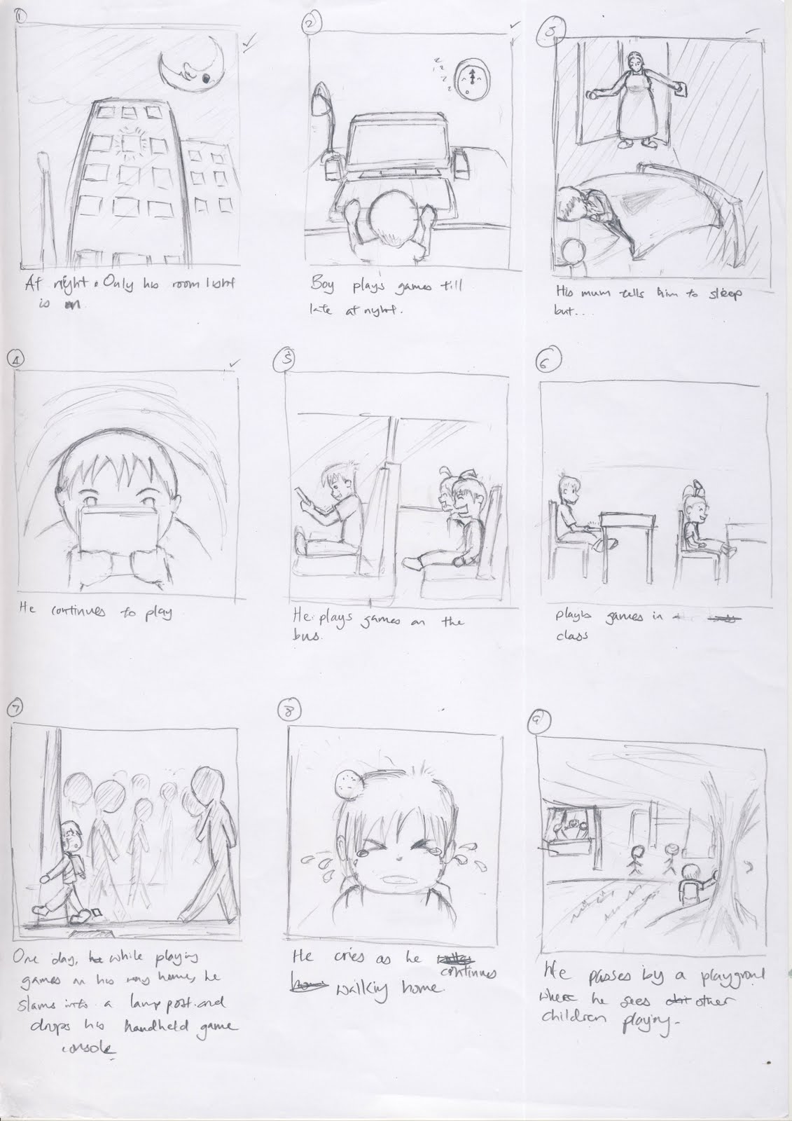
The story is about a boy who got addicted to playing games at a tender age of 7 -9 years old and how he deals with it thereafter.


The message that we wish to send across is that gaming can become an obsession if left unchecked. This is very relevant in our society today as we see kids playing their hand held game console at every place i.e. in the MRT, on the bus, in school, while walking home etc.


Final Design for the storybook


Infographic development


This is my initial design. The guy at the center is suppose to represent mankind. The whole purpose of this design is to show that we as humans have to choose which route to take. The consequences on the left are those of more death and disasters such as droughts, floods etc. On the other hand, we can choose to take actions by collaborating with one another to better manage resources, control existing usage or provide greater incentive to use alternative energies.

However I decided to scrap the idea altogether mainly because the presentation of this image makes it such that there are only 2 routes to take, which may not necessary be the case.

Infographic - Fighting Climate Change


Firstly, I have to say doing this infographic is really a challenge. Considering I have no colour sense, finding the right colour to use had become so much of a chore, it was very frustrating.
OK, moving on from my rants. The article i chose is authored by the United Nations Environment Programme in 2007.
In this infographic, I wanted to provide awareness on the more important indicators of climate changing. And since our target audience are the subscribers of such genres of magazines, I think it would be better if i leave out most of the technical details.
I wanted to show degree of worsening or improvement of each indicator. Hence, the use of the thermometer. The 'glow' of yellow and red indicators the importance level of the indicator.
I positioned the Earth close to the fire to tell the viewer that global warming does exist and it is a very serious matter that we should be concern about.
Lines are drawn from various positons on the Eart to lead the reader to the body of text which are placed close to them. Closer proximity between each text and its corresponding lines is ensured to indicate their relationship.

Saturday, April 10, 2010

Principles of Art and Design

In the lecture, the lecturer mentioned about symmetric and asymmetric designs. I think that symmetric designs are you pretty easy to produce. Such pictures usually appear to be of equal 'weight', balancing on the central fulcrum. Symmetry can also be taught of as a balanced or gradual movement away from the center point. Take for example flowers. Their petals unhold in a circular manner from the center.
Asymmetry is, on the other hand, harder to pull off as we have to consider that the 'weight' of our objects in the picture vary in sizes, shapes etc, thus making the balancing act some what more delicate. This reminds me of those physics based balancing games where you are given boxes of varying sizes and weights and your task is to balance them across some plateform.

Assignment 04 Colours and Coalition

These are the thumbnails for assignment 4. The theme for this year is "torch of friendship". The torch signifies among other things, determination, inner desire to do ones best and improve oneself. I think the ones have the black background really does make the flame stand out even more.


The elements of Art and Design

Colours. I've always thought of them as just something to give an image some vibrance. After going for this lecture, I now think that you can probably tell a different story using the same image but different colour combinations. I think it's just how our minds perceive these colours. i.e. red conveys strong emotions as it come across as being very attention grabbing.
blue on the other hand, does not have the same effect.
Furthermore, it's not just the meaning of the colour itself that is important, but rather the context in which you use it that sends the nonverbal message.